
When thinking of building a logo or even shooting a video, color plays a large part of how the consumer perceives it. Having a bright logo or packaging can help you stand out from your competitors while having dark colors can give a more subdued, modern look. When shooting commercials or product videos, doing some color correction to the footage can make an audience feel warmer or colder to the subject or person onscreen. Going through some different colors and logos, we’ll see how colors communicate themselves through your product.
Red

The color red is always a great color for a brand. When you see red, your eye is drawn to it. Most of the time when you see it out in the world it’s a warning sign or something that tells you to stop and look. Having it as part of your brand draws a person’s eyes toward your product. It’s a distinct color that attracts the eye as a primary color or an accent.
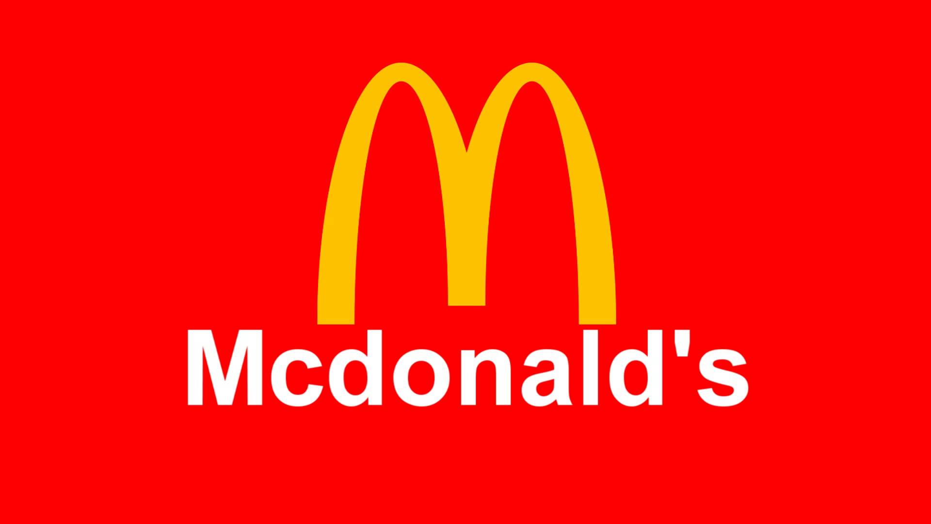
McDonald’s logo is a great instance of a brand popping out in front of you. Having the red as a base for the yellow arches makes the logo look great on a sign. Whenever people are driving on the road and see this sign, they know a restaurant and a place to rest are nearby. The Puma logo with the red base and white text are great contrasts of each other. The red stays in the background while the white pops out with the puma. This helps with the active lifestyle feeling this brand tries to convey.
When editing videos, having a warm color palette can make the viewer feel closer to the subject. That’s why ads involving a product with a family or tradition will increase the red tones of the video a bit. It gives you the feeling of family, togetherness and makes what you’re trying to get across easier to digest for the viewer and feel familiar as well.
Blue

The color blue represents trust, reliability, protection and can also show off modernity and become a corporate color. Brands that include blue help to convey trust and safety which is good for long lasting established brands. A lot of banks use blue in their color scheme along with security companies. It’s also a go to corporate color because it’s inoffensive to the eyes and is easily recognizable as a business color.
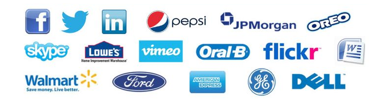
JPMorgan uses the blue color scheme for trustworthiness and reliability in their brand, Dell uses the color because of the association with blue and technology.
Blue can also be used in videos to make the scene cooler, this works well when you want to show off new products such as new computers, phones and other electronics. A little amount of blue can also be a neutralizer toning down some of the colors in the scene.
Some of the other colors people use like yellow or green can pop out as well. Yellow, being a bright color can be perceived as lively and and active. It’s a great color to use when emphasizing motion in a logo or promoting an active lifestyle, it goes well with red as seen with the McDonald’s logo and the DHL delivery service logo. Green on the other hand, conveys nature, freshness and reusability. When used as packaging for food, green is used to give the food an organic or farm to table feeling even if the food has chemicals in it. Subway has the green accent on their food to emphasize freshness of their food even though some of their food sits out the entire day. Green is also used whenever someone wants to show their product or their brand is eco friendly.
So remember, when you look for a color to go with your brand, make sure what your company does and stands for is represented through color choice as well, it’s always the first thing the consumer sees.