THE JOB
The client – a research center that researches and advocates for outdoor worker safety – needed a more distinctive brand identity that directed a strong nod at their affiliation with the University of Texas.
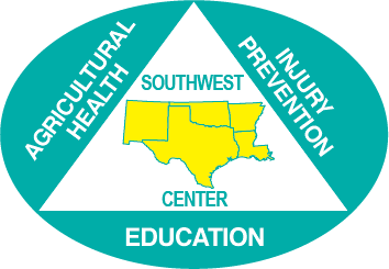
The client’s original logo is shown below.
THE PROCESS
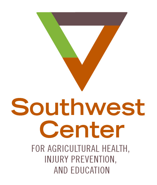
We established early on with the client that the original highlighter yellow and teal color palette was no longer desirable. Instead we built a palette around University of Texas’ burnt orange color. Green and brown seemed strong complementary choices, given the client’s mission.
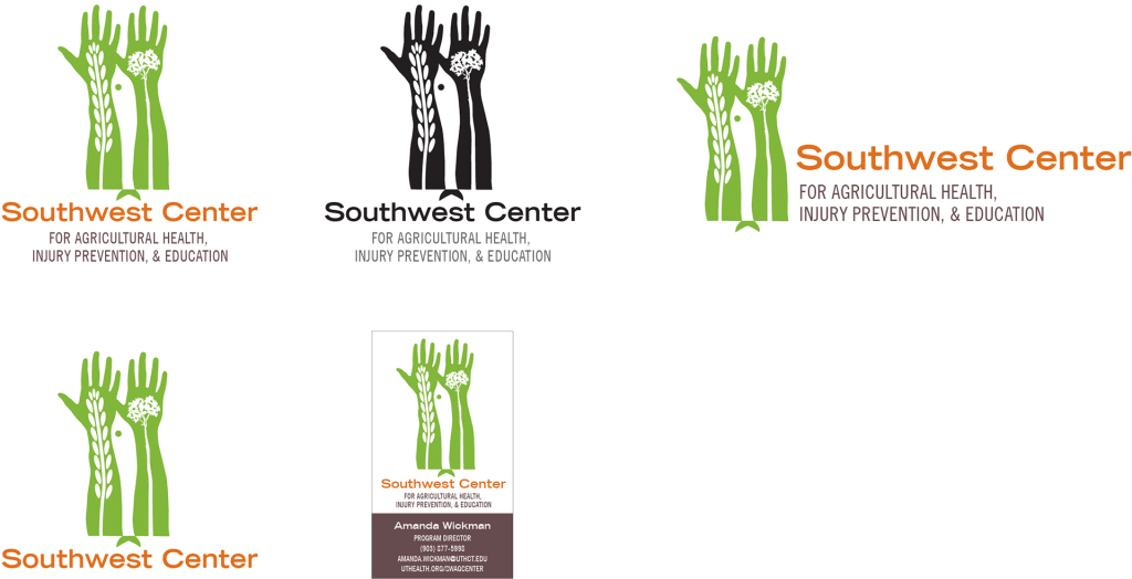
We explored two main logo concepts with the client, one that took a pictographic approach (below) to show the client’s focus on agriculture, fishing, and forestry industries, while keeping workers’ interests at the forefront by framing the entire graphic within a pair of hands….
THE RESULT
The client loved the look and symbolism of the pictographic logo above – though if they’d gone this route, the concept would have needed some work. (Maybe the leftmost hand should be flipped, and one person pointed out that the hands looked a little like a zombie emerging from a grave, which gave us a good laugh.)
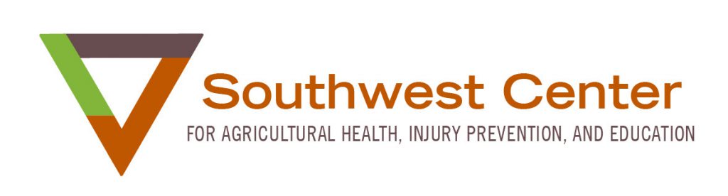
The client instead opted for the second, more geometric logo concept (shown below in its horizontal and vertical variations). This more abstract logo also gestures at the center’s tripartite focus. The burnt orange checkmark enclosed within the triangle references the center’s role in monitoring safety compliance.
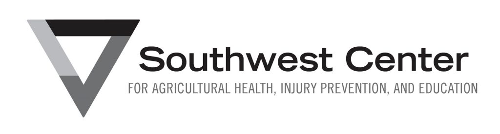
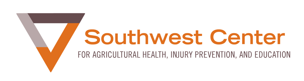
Once the logo was finalized, we created a wide variety of logotypes for the client, including print- and web-ready files and grayscale, white, and two-color versions of the logo. Some of these variations are shown below.
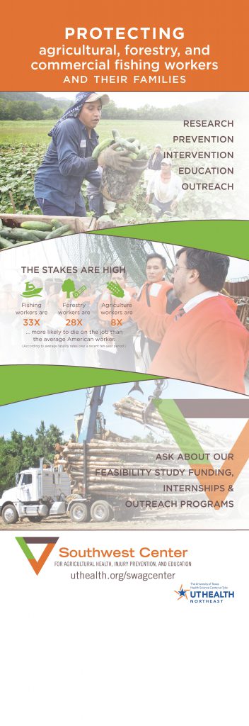
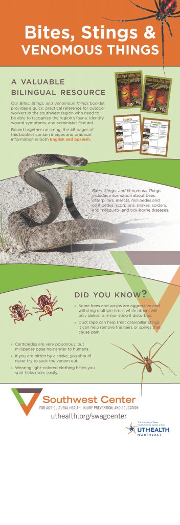
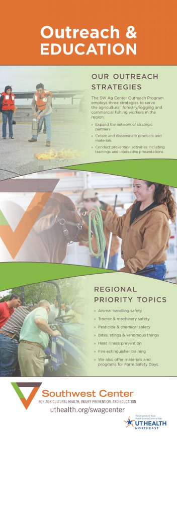
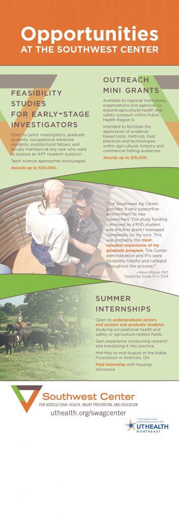
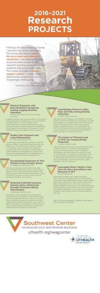
We also designed five pop-up banners for the client, using the new logo as the launching pad for a whole new branded look.